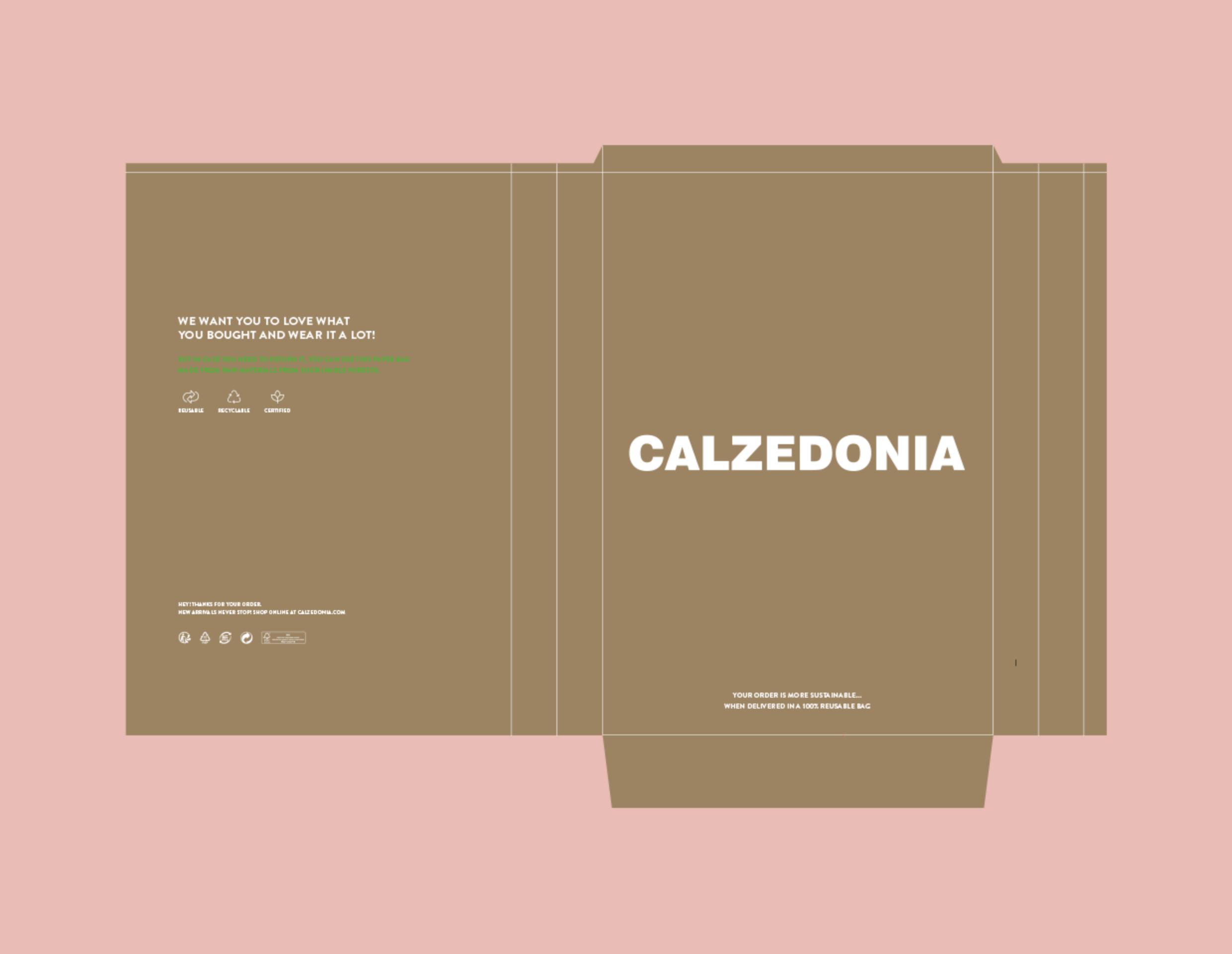
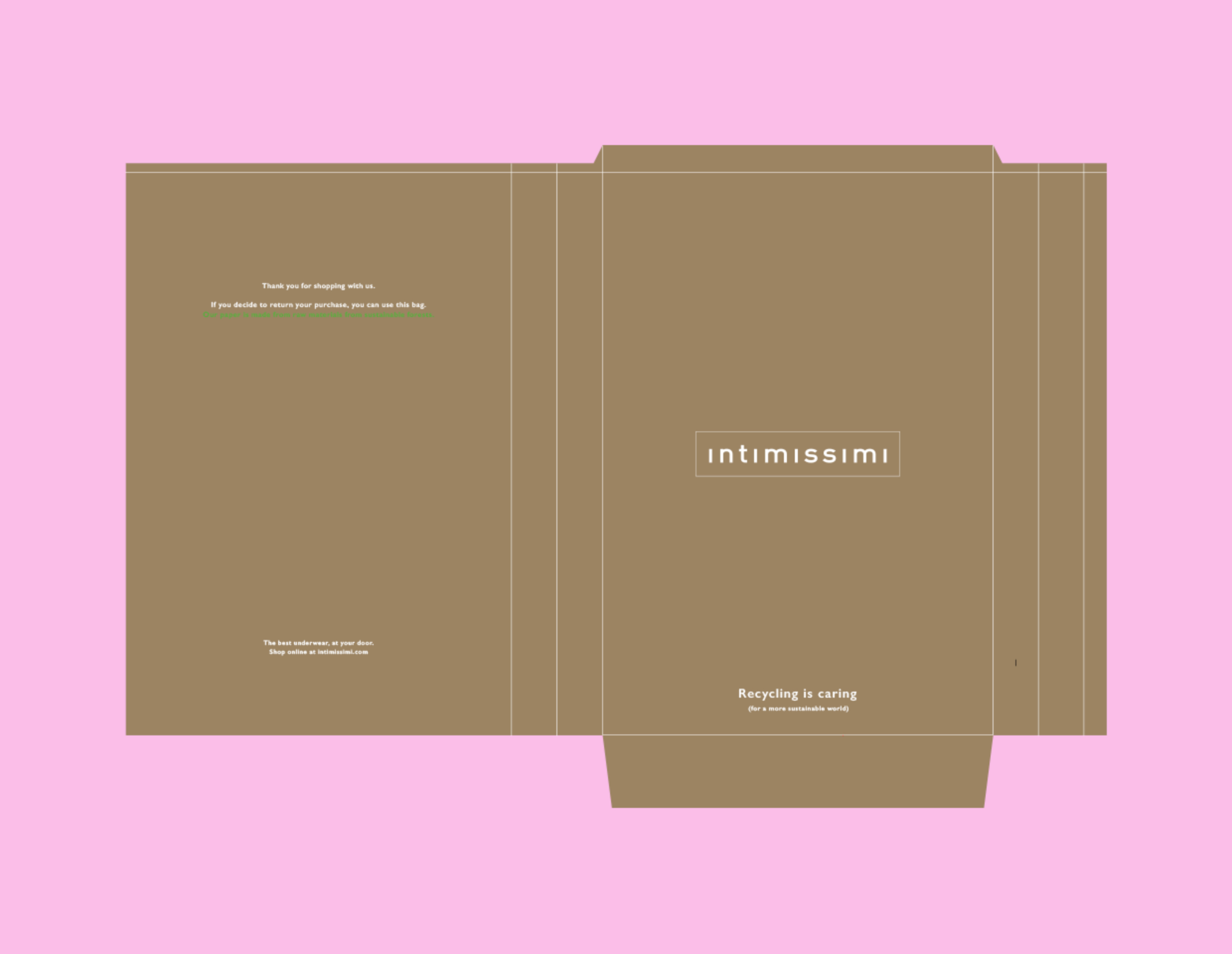
There was also another big challenge at the same time: to respect the distinction between each brand within the group. So, before the designing part, we decided to identify the key-points of each of them. Feminine, positive and pop for Calzedonia. Elegant, sophisticated and premium for Intimissimi. And, finally, young, bold and informal for Tezenis. Having identified these three words, we went on to the practical side of the project. From original sketches to the copywriting, everything was done in house. The result is quite different and complementary – just as it should be.
Calzedonia
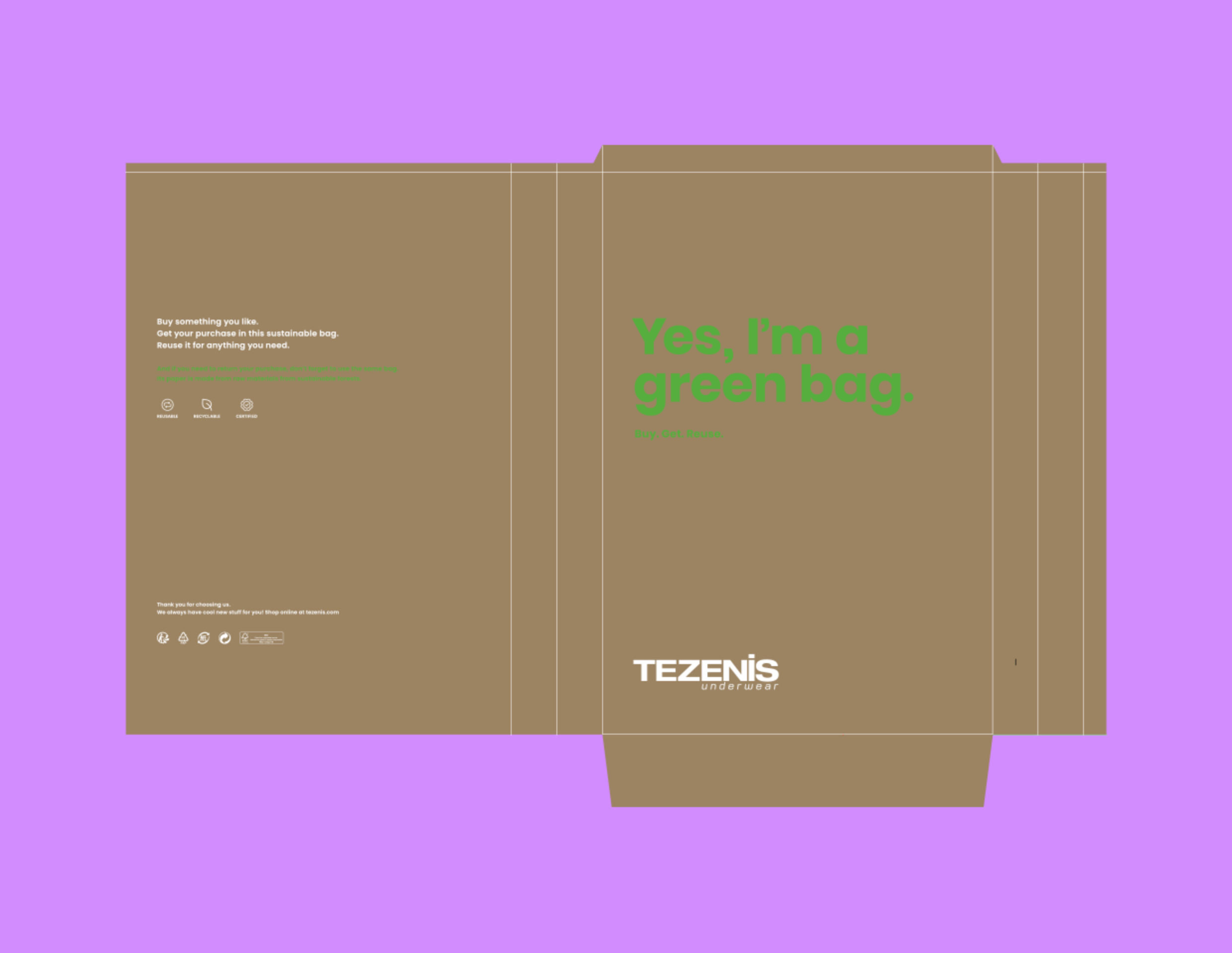
Going greener with sustainable packaging
- Industrial Design
client
Calzedonia Groupoutput
Packaging designcreative fields
BrandingWhen Frank Studio started developing the concept for the new packaging design for Calzedonia Group's online orders, the main task was to focus on sustainability because they were making the important move of substituting plastic delivery bags with recycled paper ones.


View Also
M Missoni
A new identity inspired by heritage
Acqua di Parma